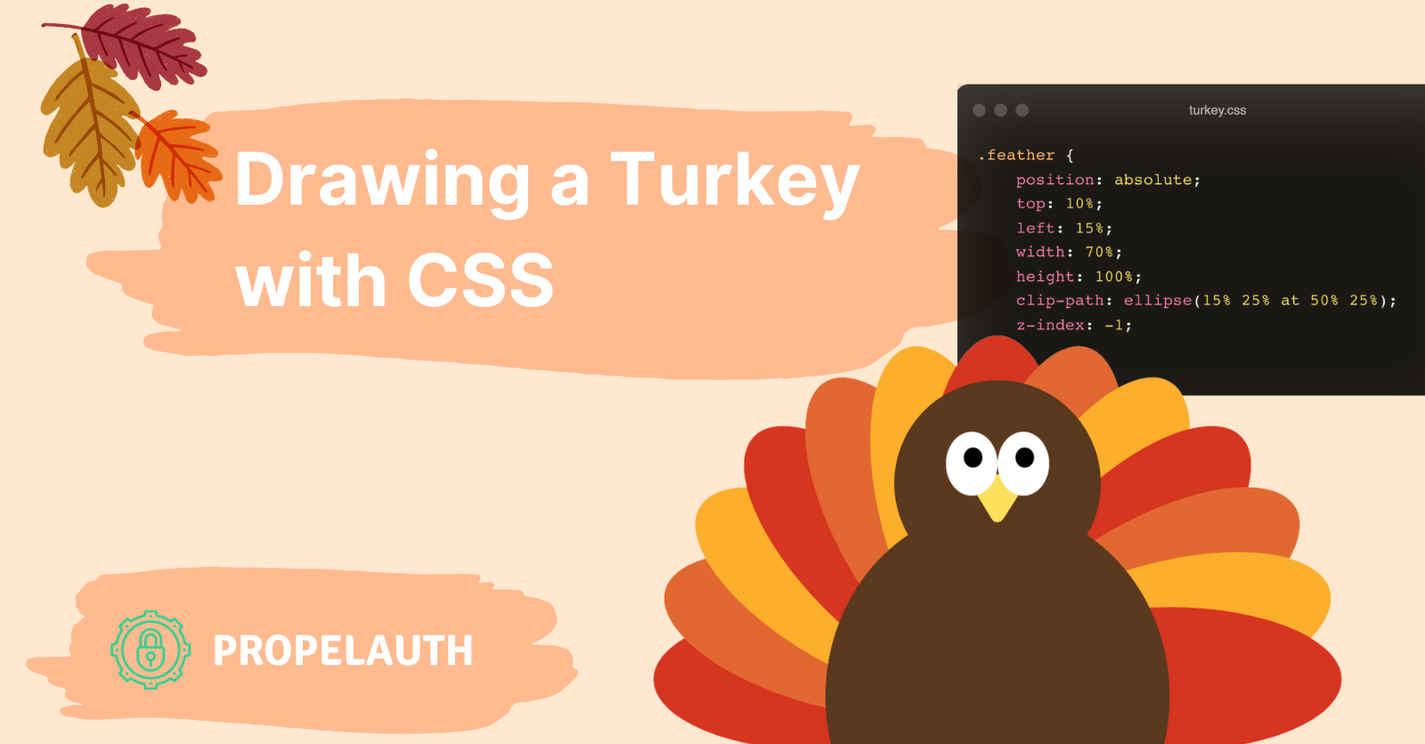
Drawing a Turkey with CSS

If you were tasked with creating a piece of art, what tools would you use? Photoshop? Canva? Figma?
What if I told you there was another way that’s more unwieldy and requires a lot more guess work? If that excited you, using pure CSS to create images is for you!
In all seriousness, while you probably don’t want to create full images in CSS, understanding how you could and what CSS primitives are available can help improve your designs and overall CSS knowledge. Since Thanksgiving is coming up, let’s make this turkey:

Where do we even start?
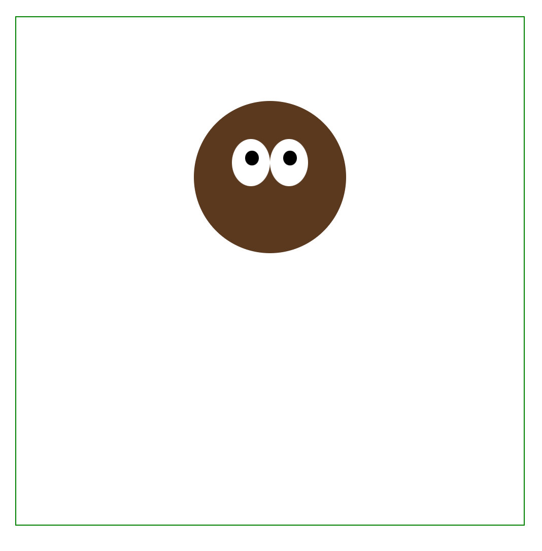
Let’s start off very simple and just create a circle. I’m going to use a React application, but the same things apply to raw HTML, Vue, whatever you prefer.
First, we’ll create a container that will hold all the components of the image. Then, we’ll create a circle that’s directly in the center of the container, and we’ll break down how it works afterwards.
.container {
    position: relative;
    /* Add margin to the top so it isn't right against the top of the screen */
    margin: 32px auto auto;
    width: 500px;
    height: 500px;
    /* Add a border for debugging, remove later on */
    border: 1px solid green;
}

.circle {
    position: absolute;
    top: 25%;
    left: 25%;
    width: 50%;
    height: 50%;
    background: #5A391E;
    border-radius: 50%;
}
function Turkey() {
    return <div className="container">
        <div className="circle" />
    </div>
}
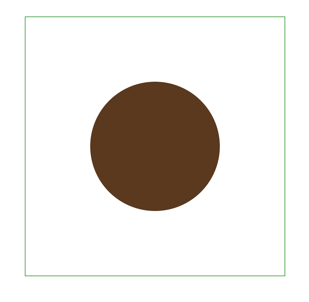
So let’s break down the circle class. It starts with position: absolute which allows us to place it in an exact position within our container.
We’ll use percentages for our height, width, left, and top so that everything will fit and resizing our container won’t mess up the image.
top: 25%;
left: 25%;
width: 50%;
height: 50%;
The width and height of the image are 50% of the total container size. To center the circle, we place the leftmost side at 25% and the topmost side at 25%. How did we get 25%? Well, there are three variables to consider:
- The space on the left of the shape (as specified by left)
- The shape itself (as specified width)
- The space on the right of the shape (implicitly defined by whatever is left over, or 100% - width - left)
A shape is centered if the space on the left and right are equal. Since 50% is taken up by the shape itself, we split the remaining 50% equally on left and right (50 / 2 = 25).
And finally, the border-radius is used to turn the square into a circle by smoothing all the corners.
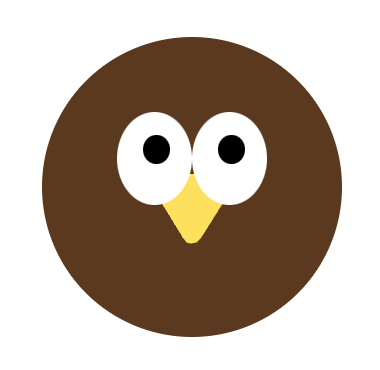
Let’s move it up a bit and make it a bit smaller:
.head {
    position: absolute;
    top: 16.5%;
    left: 35%;
    width: 30%;
    height: 30%;
    background: #5A391E;
    border-radius: 50%;
    z-index: 0;
}
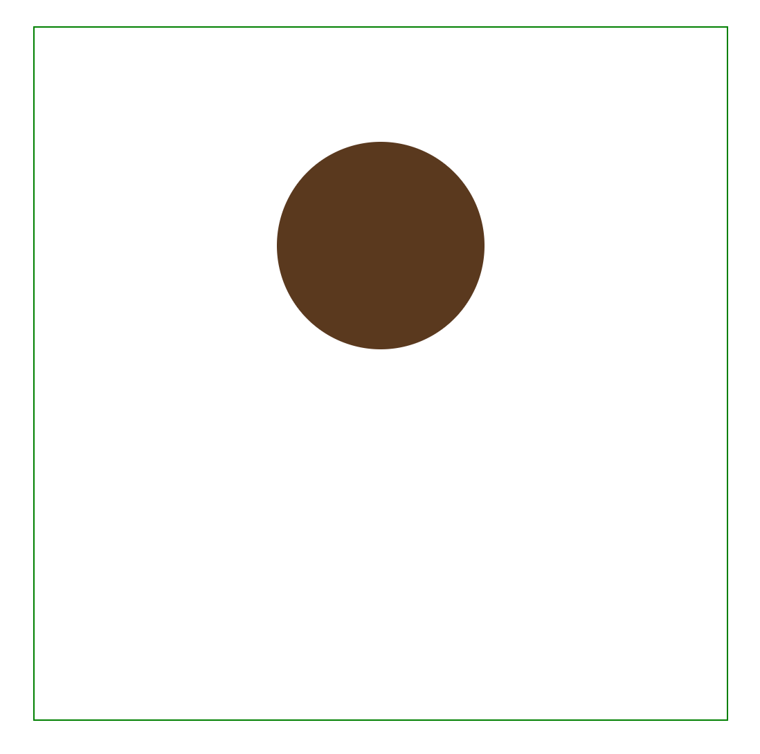
And now we have the head of our turkey!
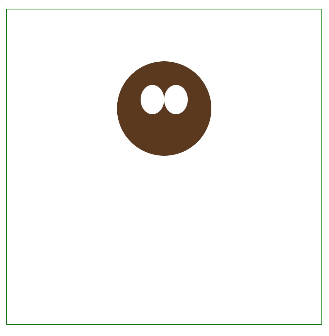
Adding and positioning the eyes
Our turkey component so far looks like this:
function Turkey() {
    return <div className="container">
        <div className="head" />
    </div>
}
When we add eyes, we’ll want to add them as children of the head div:
function Turkey() {
    return <div className="container">
        <div className="head">
            <div className="eye eye-left" />
            <div className="eye eye-right" />
        </div>
    </div>
}
The positioning of the eyes are now going to be relative to the “head” container. Let’s look at the CSS for the eyes:
.eye {
    position: absolute;
    /* The eye shouldn't be a perfect circle,
       so we make the height slightly larger */
    width: 25%;
    height: 31%;
    /* The eyes are aligned vertically.
       Note that this position is relative to the head div not the container div */
    top: 25%;
    background: white;
    border-radius: 50%;
    /* It needs to be displayed in front of the head, so add a larger z-index */
    z-index: 10;
}

.eye-left {
    left: 25%;
}

.eye-right {
    right: 25%;
}
The only difference between the eyes is that one is on the left and one is on the right, so they share the eye class, and then their positioning on the head is changed via the eye-left and eye-right classes.
Without pupils, it’s a little spooky... let’s quickly add those.
.pupil {
    position: absolute;
    width: 35%;
    height: 31%;
    top: 25%;
    left: 35%;
    background: black;
    border-radius: 50%;
}
function Turkey() {
    return <div className="container">
        <div className="head">
            <div className="eye eye-left">
                <div className="pupil"/>
            </div>
            <div className="eye eye-right">
                <div className="pupil"/>
            </div>
        </div>
    </div>
}
How do we create custom shapes?
So far, our turkey is made up of exclusively circles and ovals. To add a beak, we’re going to need a more custom shape. Luckily, we can use the css property clip-path, which allows us to specify custom polygons.
Here’s a quick example of what we can do with clip-path:
.pentagon {
    position: absolute;
    top: 25%;
    left: 25%;
    width: 50%;
    height: 50%;
    background: #5A391E;
    /* These make up the vertices of a pentagon */
    clip-path: polygon(50% 0%, 100% 38%, 82% 100%, 18% 100%, 0% 38%);
}
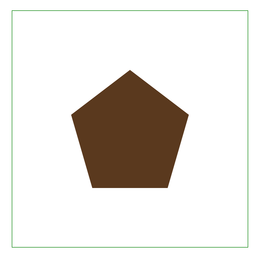
And this is actually the only other piece of the puzzle we need to complete the turkey. We can make arbitrary shapes, scale them to whatever size we want, and position them anywhere in our container.
It’s painful and tedious to manually create your own clip-path, but luckily tools like this exist to make it significantly easier.
Adding the beak
We’re going to use Bennett Feely’s clip-path maker and draw our best beak. After that, the rest is exactly the same as all our other elements - we just need to position and size them.
.beak {
    position: absolute;
    top: 40%;
    left: 35%;
    width: 30%;
    height: 30%;
    background: #FEE05F;
    /* Hand drawn with <3 */
    clip-path: polygon(7% 36%, 40% 90%, 44% 95%, 47% 96%, 50% 96%, 55% 95%, 60% 90%, 94% 36%, 95% 30%, 95% 26%, 90% 23%, 86% 20%, 77% 18%, 10% 20%, 6% 22%, 4% 26%, 4% 31%);
}
Not bad for something hand-drawn!
Adding the body and feathers
The body should be very easy to add because it’s just another oval.
.body {
    position: absolute;
    top: 35%;
    left: 25%;
    width: 50%;
    height: 55%;
    background: #5A391E;
    border-radius: 50%;
    z-index: 5;
}
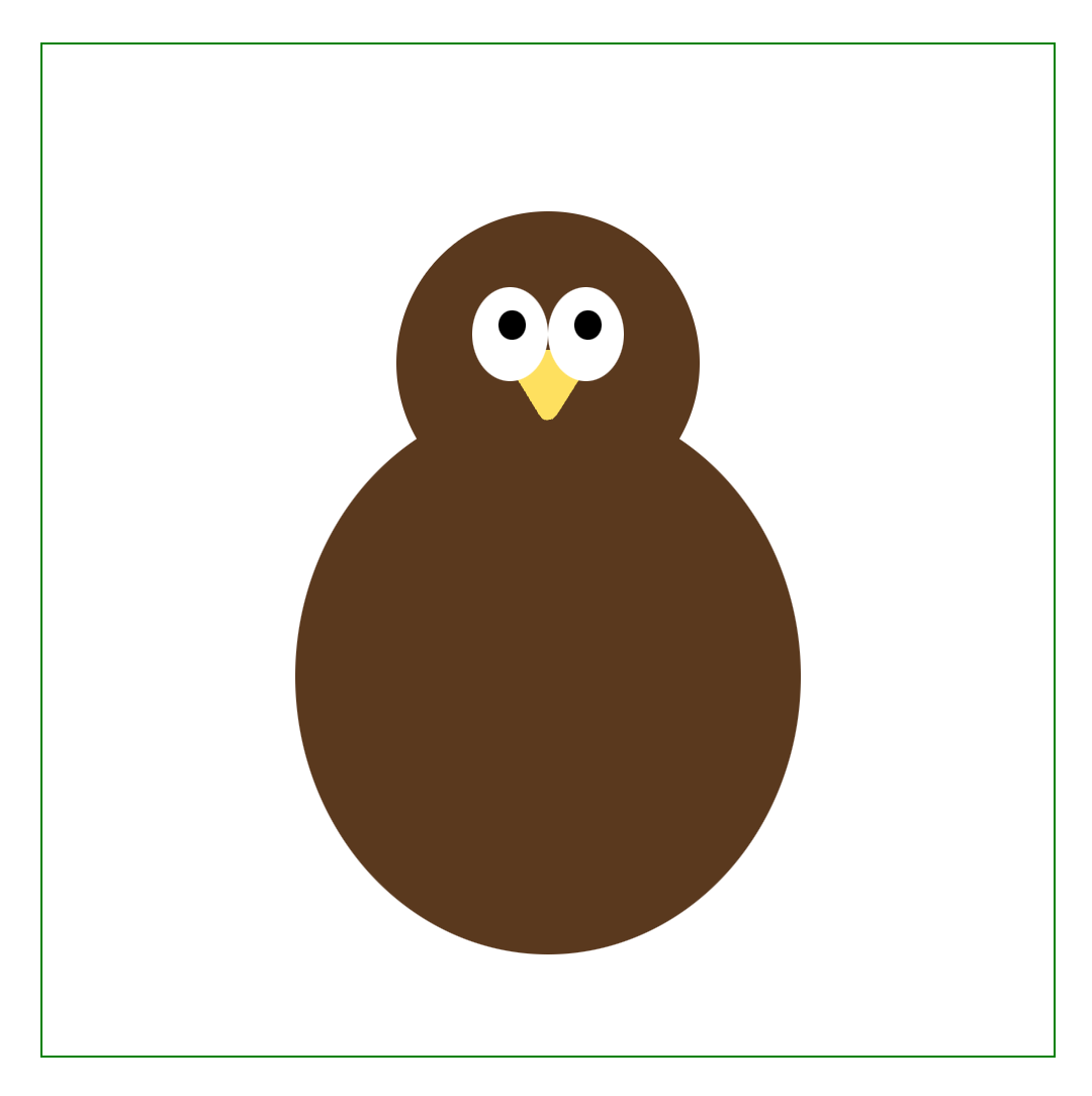
We’re almost there, we just need some feathers. To achieve this, we’re going to actually just create one single feather and every other feather will just be a rotated and recolored version of that first one.
Let’s remove everything for a second and just create a single feather-like oval. Here’s our oval in the clip-path generator:
Here’s the CSS for two feathers, one of which is rotated 90 degrees from the other:
.base-feather {
    position: absolute;
    top: 25%;
    left: 25%;
    width: 50%;
    height: 50%;
    clip-path: ellipse(25% 40% at 50% 50%);
    background: red;
}

.rotated-feather {
    position: absolute;
    top: 25%;
    left: 25%;
    width: 50%;
    height: 50%;
    clip-path: ellipse(25% 40% at 50% 50%);
    background: orange;
    rotate: 90deg;
}
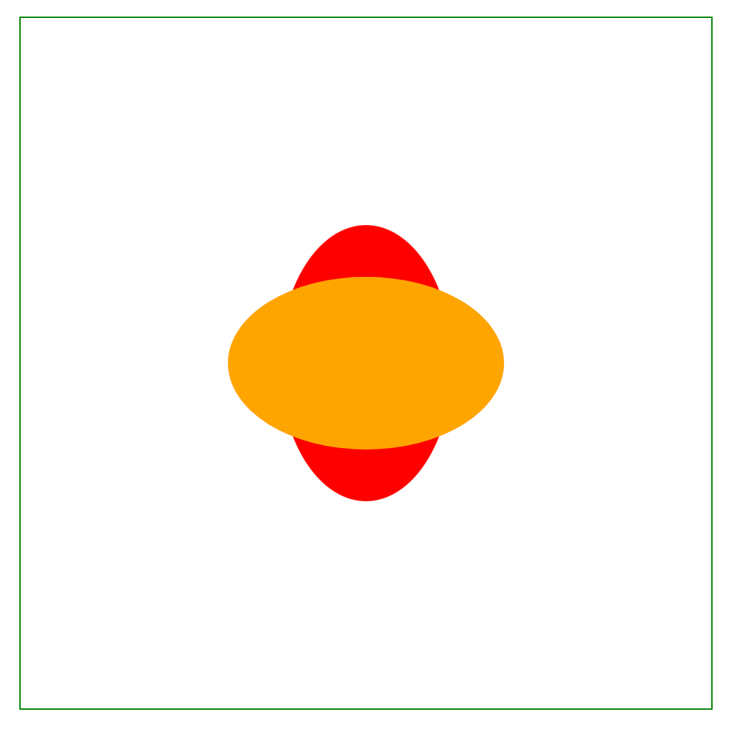
One thing to note is the rotation happens from the center of the shape. If we want our feathers to fan out like this
we instead would want the rotation to be centered around the end of the oval.
There’s actually a pretty simple fix here - what if the center of our “shape” was the end of the oval?
By making a custom oval shape that ends in the center, when we rotate our shape, it’ll be around the base of the feather.
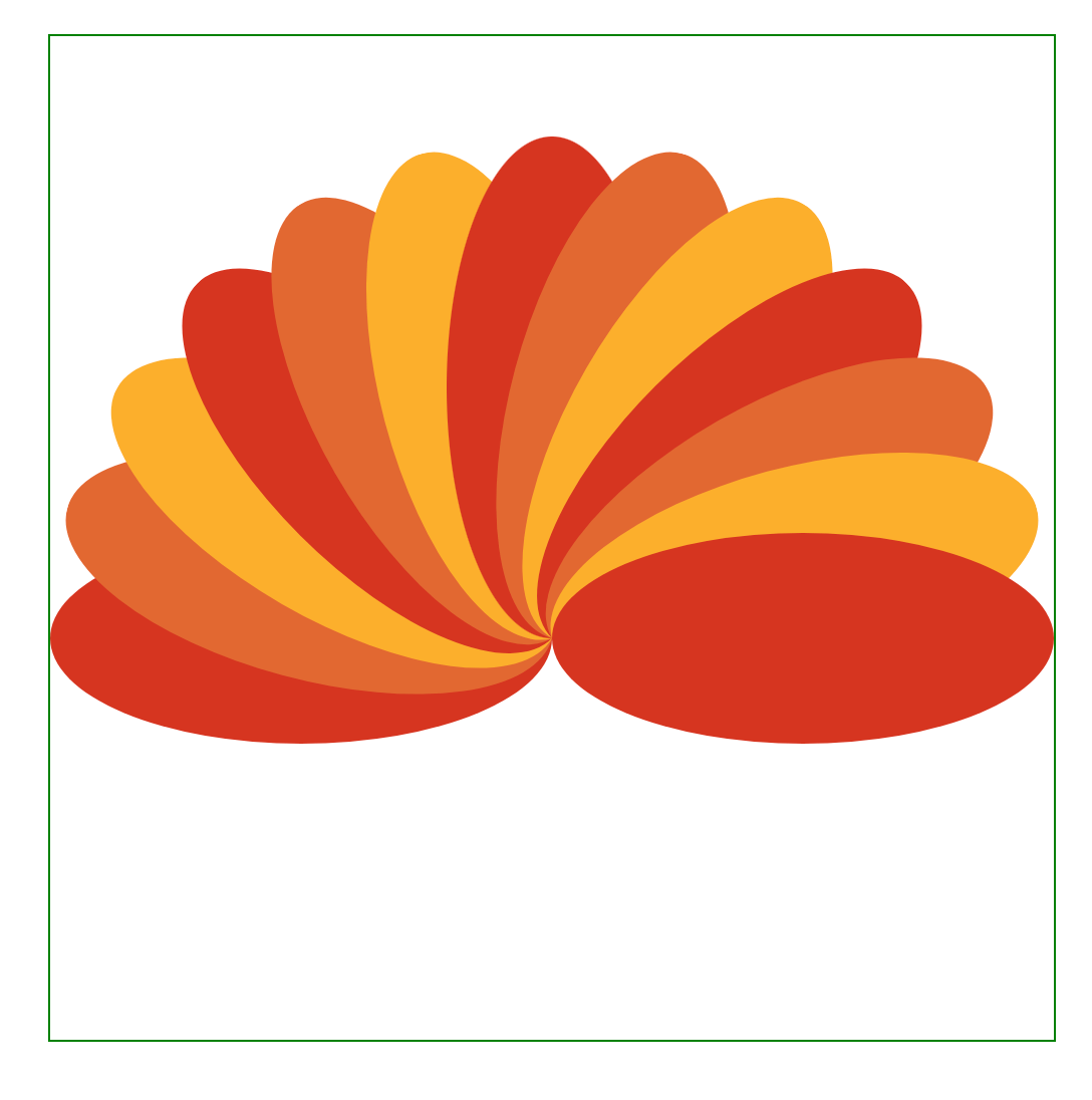
And we are now ready to put it all together! Here’s the css for our feather:
.feather {
    position: absolute;
    top: 10%;
    left: 15%;
    width: 70%;
    height: 100%;
    clip-path: ellipse(15% 25% at 50% 25%);
    z-index: -1;
}
Along with some code to cycle through different colors and rotations:
const FEATHER_COLORS = ['#D63420', '#E26831', '#FCAF2C']

function Turkey() {
    const feathersRotationDegrees = [-90, -75, -60, -45, -30, -15, 0, 15, 30, 45, 60, 75, 90]

    return <div className="container">
        <div className="head">
            <div className="eye eye-left">
                <div className="pupil"/>
            </div>
            <div className="eye eye-right">
                <div className="pupil"/>
            </div>
            <div className="beak"/>
        </div>
        <div className="body"/>
        {feathersRotationDegrees.map((degree, i) => (
            <div key={degree} className="feather" style={{
                rotate: `${degree}deg`,
                background: `${FEATHER_COLORS[i % FEATHER_COLORS.length]}`
            }}/>
        ))}
    </div>
}
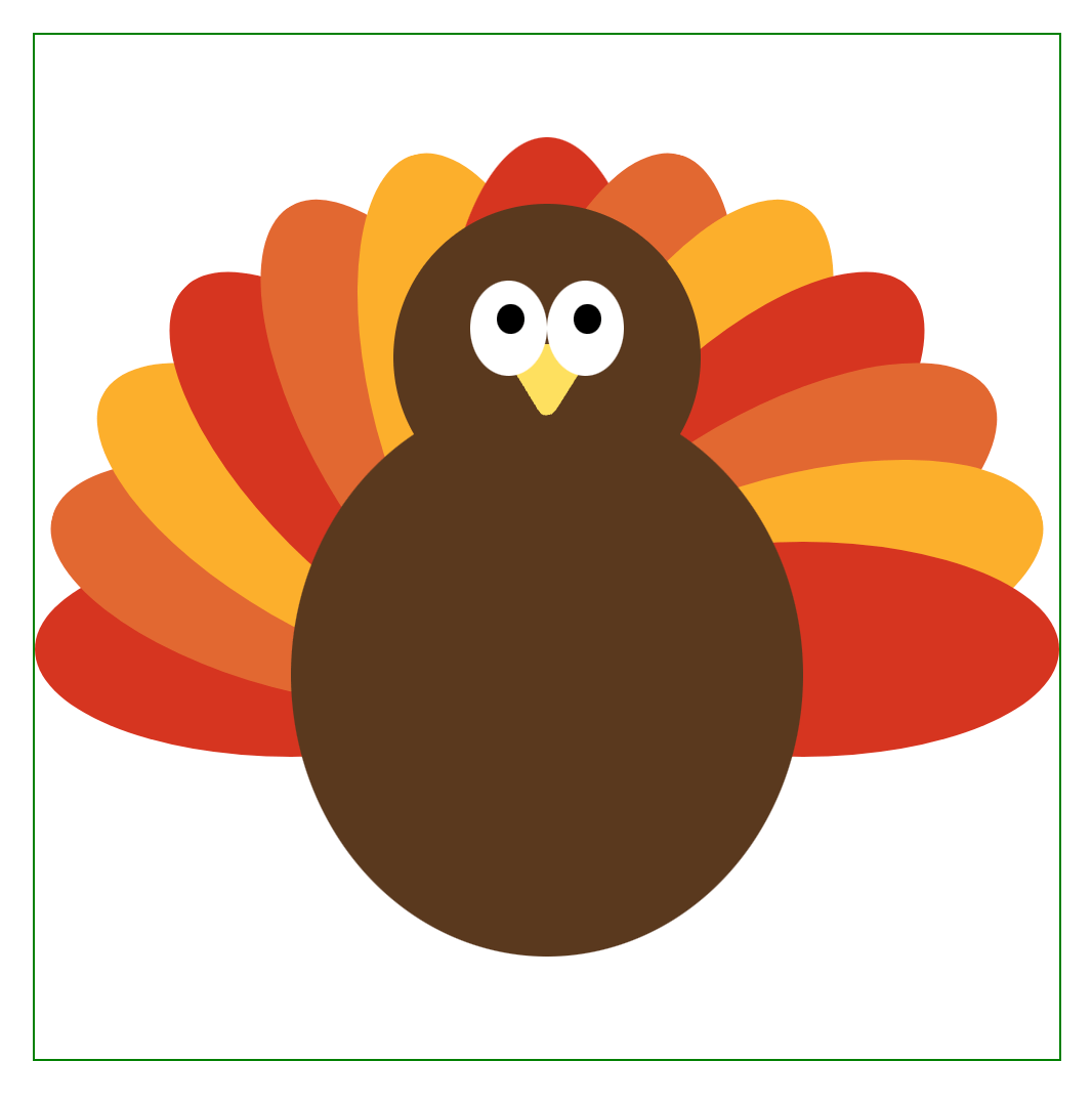
Which produces our final image:
Customizing the number of feathers
In our above code snippet, we hard coded the degree offsets for each of the feathers. We can actually generate those offsets programmatically:
function getRotationDegreesForFeathers(numFeathers) {
    const numFeathersOnEachSide = Math.floor(numFeathers / 2)
    const feathersRotationDegrees = [0]
    // Return early to avoid dividing by 0
    if (numFeathersOnEachSide === 0) {
        return feathersRotationDegrees
    }

    const step = 90 / numFeathersOnEachSide
    for (let degree = step; degree <= 90; degree += step) {
        feathersRotationDegrees.push(-degree)
        feathersRotationDegrees.push(degree)
    }

    // Since we use the ordering to determine each feather's color
    //    we need to sort.
    return feathersRotationDegrees.sort((a, b) => a - b)
}
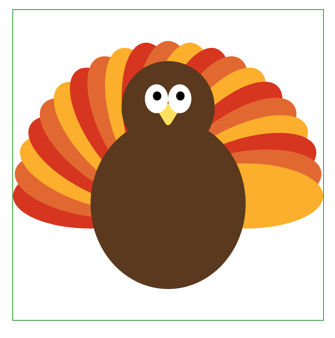
And then you can easily generate turkeys with 21 feathers:
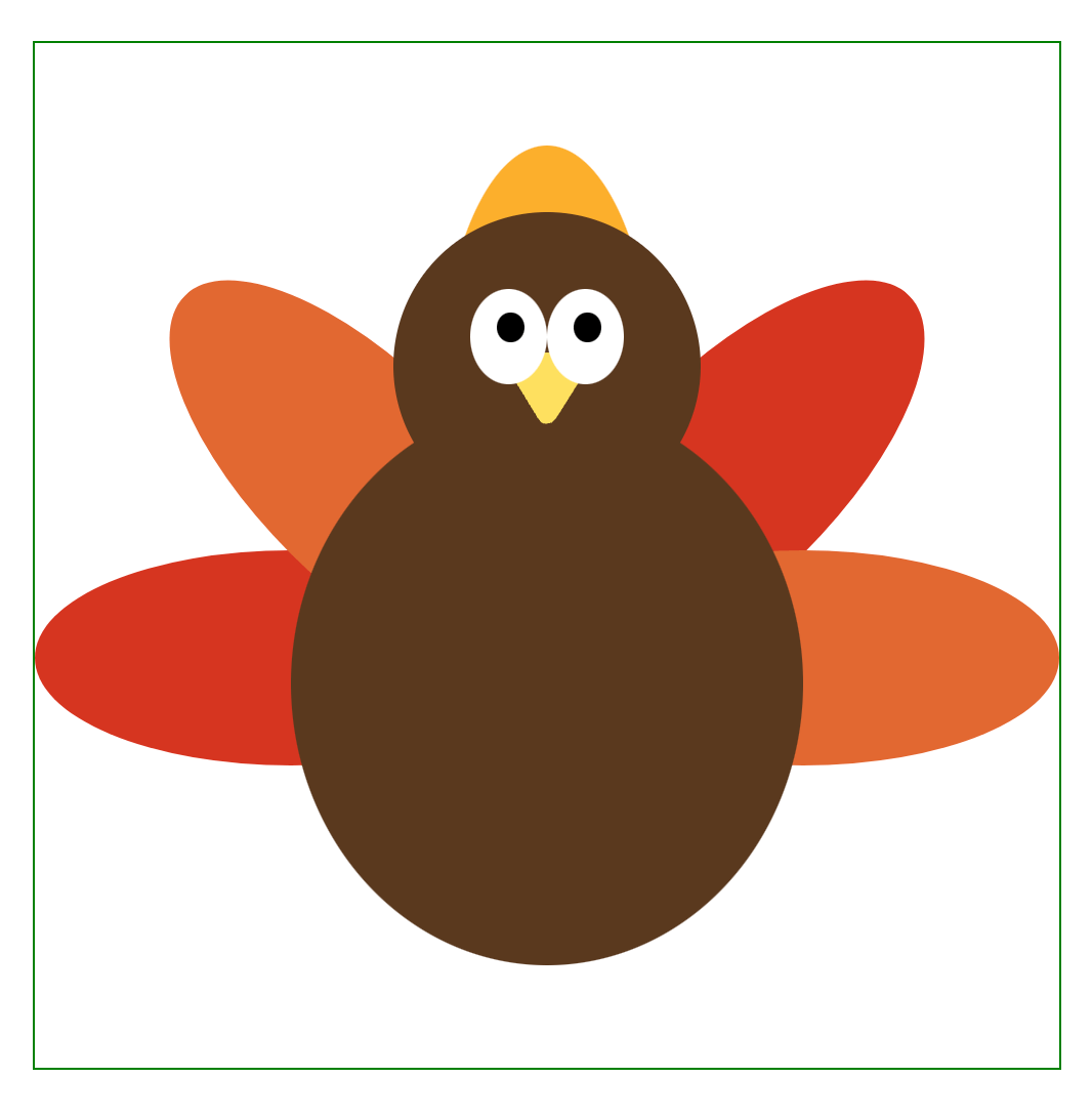
Or the sad looking 5 feathered turkey:
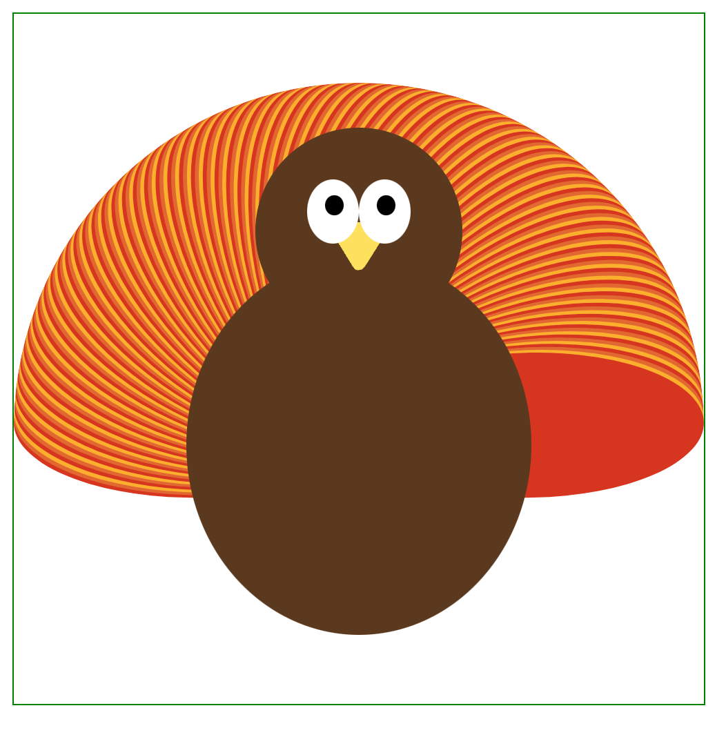
Or the very overwhelming 201 feathered turkey:
Summary
In this post, we learned how to generate arbitrary shapes with CSS. We then learned how to scale, rotate, and position those shapes in order to create your own artwork.
While you probably shouldn’t create giant works of art in pure CSS, you can use these techniques to add a little more pizzazz to your designs.