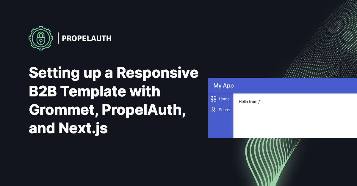
Setting up a Responsive Multi-Tenant Template with Grommet, PropelAuth, and Next.js

Grommet is a React-based framework that provides tools for you to quickly build responsive and accessible applications. It has some of the most intuitive components for setting up the structure of your product (e.g. headers, footers, responsive sidebars, etc).
In this post, we’ll set up a new responsive frontend using Grommet, PropelAuth, and Next.js. We’ll start by building a skeleton that looks like this:
.gif)
Then we’ll make the sidebar responsive, so it displays differently on smaller devices:
.gif)
And finally we’ll add B2B support so our users can create/join organizations, and display the information in the sidebar:
.gif)
Creating an AppBar with Grommet and Next.js
Let’s get started by creating a new Next.js application.
$ npx create-next-appAdd the Grommet top level container to your _app.js
function MyApp({Component, pageProps}) {
    return <Grommet full>
        <Component {...pageProps} />
    </Grommet>
}
We can then make a new file components/AppBar.jsx which contains our header. This example is taken, with small modifications, from Grommet’s getting started guide for React.
import {Box, Button, Heading} from "grommet";
export default function AppBar() {
return <Box
tag='header'
direction='row'
align='center'
justify='between'
background='brand'
pad={{left: 'medium', right: 'small', vertical: 'small'}}
elevation='xsmall'
style={{zIndex: '1'}}
>
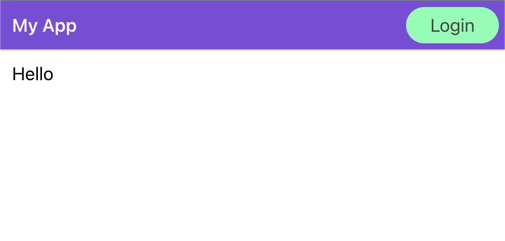
<Heading level='3' margin='none'>My App</Heading>
<Button primary label="Login"/>
</Box>
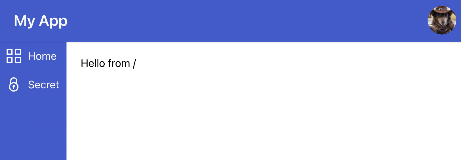
}If we go to our index.js file and update it to use the AppBar:
import Head from 'next/head'
import {Box} from "grommet";
import AppBar from "../components/AppBar";

export default function Home() {
    return <Box fill>
        <Head>
            <title>Create Next App</title>
            <meta name="description" content="Generated by create next app"/>
            <link rel="icon" href="/favicon.ico"/>
        </Head>
        <AppBar/>
    </Box>
}
We get:
Creating a Sidebar with Gromment and Next.js
Next let’s create the sidebar using Grommet’s Sidebar component:
import {Button, Nav, Sidebar} from "grommet";
import {Secure, Projects} from "grommet-icons";
import Link from "next/link";
const MySidebar = () => {
return <Box background="brand" fill gap="medium" pad="medium">
<Button icon={<Projects/>} plain label="Home"
href="/" as={(props) => <Link {...props} />}/>
<Button icon={<Secure/>} plain label="Secret"
href="/secret" as={(props) => <Link {...props} />}/>
</Box>
}
}
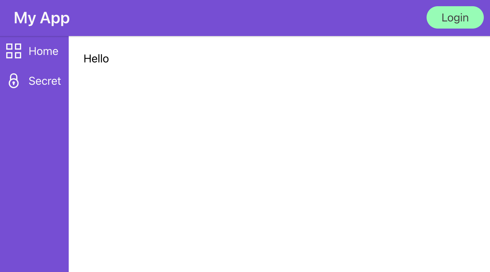
export default MySidebarYou can see that we created two pages / and /secret and we are rendering them as Links to get smooth transitions between the different pages.
Then we just need to hook it up in pages/index.js
export default function Home() {
    return <Box fill>
        <Head>
            <title>Create Next App</title>
            <meta name="description" content="Generated by create next app"/>
            <link rel="icon" href="/favicon.ico"/>
        </Head>
        <AppBar/>
        <Box direction='row' flex overflow={{horizontal: 'hidden'}}>
            <MySidebar />
            <Box flex margin="medium">
                Hello from /
            </Box>
        </Box>
    </Box>
}
If you click Secret, you’ll get a 404 because we haven’t created pages/secret.js. Before we do that, since a lot of the logic will be repeated, let’s take a second to make a new useful component components/PageWrapper.js
import {Box} from "grommet";
import Head from "next/head";
import AppBar from "./AppBar";
import MySidebar from "./MySidebar";

export default function PageWrapper({title, description, children}) {
    return <Box fill>
        <Head>
            <title>{title}</title>
            <meta name="description" content={description} />
            <link rel="icon" href="/favicon.ico"/>
        </Head>
        <AppBar/>
        <Box direction='row' flex overflow={{horizontal: 'hidden'}}>
            <MySidebar />
            <Box flex margin="medium">
                {children}
            </Box>
        </Box>
    </Box>
}
And then our pages/secret.js can just look like:
import PageWrapper from "../components/PageWrapper";

export default function Secret() {
    return <PageWrapper title="Secret" description="shhhh">
        Hello from /secret
    </PageWrapper>
}
Theming your application
Purple not your color? We can theme our entire application by passing in a theme to our Grommet component in src/_app.js
const theme = {
    global: {
        colors: {
            brand: '#3c5ccf',
        },
    },
};

function MyApp({Component, pageProps}) {
    return <Grommet full theme={theme}>
        <Component {...pageProps} />
    </Grommet>
}
Adding user authentication to our AppBar
Our login button right now is just for show and our secret page is… not very secret. PropelAuth is a service that provides hosted user authentication. It provides fully hosted UIs including signup, login, and account management. For B2B/multi-tenant applications, it also provides organization management/RBAC.
You can follow the getting started guide to configure your page, ours looks like this:
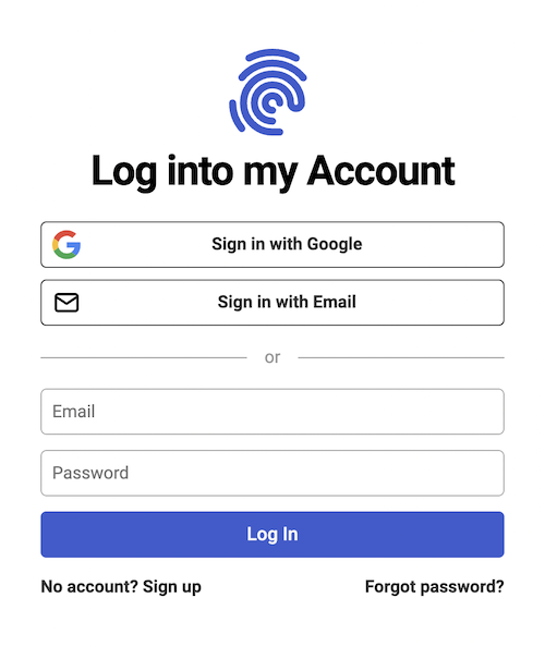
Since we turned on Google login and magic link/passwordless login.
Back in our Next.js file, let’s hook it all up. We start by installing the @propelauth/react library:
$ yarn add @propelauth/reactand adding an AuthProvider to our _app.js
import {AuthProvider, loadOrgSelectionFromLocalStorage} from "@propelauth/react";

function MyApp({Component, pageProps}) {
    return <Grommet full theme={theme}>
        <AuthProvider authUrl={process.env.NEXT_PUBLIC_AUTH_URL}
    getActiveOrgFn={loadOrgSelectionFromLocalStorage}>
            <Component {...pageProps} />
        </AuthProvider>
    </Grommet>
}
You can get your authUrl from your dashboard. If you use env variables like we did above, make sure to restart the server after setting up the .env file. getActiveOrgFn enables you to select the currently active organization. localOrgSelectionFromLocalStorage is a function that loads an orgId value from localStorage, if any was set. We'll use these later on to let a user switch organizations they are currently viewing.
The AuthProvider is responsible for fetching user and organization information from PropelAuth for the current user. The provider makes sure fetching only happens once, no matter how many components/pages need the information.
Next we’ll update our components/AppBar.jsx. We want the Login button to redirect to a login page and after they are logged in to display some information about the user.
import {Avatar, Box, Button, Heading, Spinner} from "grommet";
import {useAuthInfo, useRedirectFunctions} from "@propelauth/react";

export default function AppBar(props) {
    return <Box {/*... truncated for space */}>
        <Heading level='3' margin='none'>My App</Heading>
        <AuthButtons />
    </Box>
}

const AuthButtons = () => {
    const authInfo = useAuthInfo();
    const {redirectToLoginPage, redirectToAccountPage} = useRedirectFunctions();

    if (authInfo.loading) {
        return <Spinner />
    } else if (authInfo.isLoggedIn) {
        return <Avatar src={authInfo.user.pictureUrl} onClick={redirectToAccountPage}/>
    } else {
        return <Button primary label="Login" onClick={redirectToLoginPage} />
    }
}
Our new AuthButtons has three states:
- Loading the current user’s information. This only happens once on initial page load.
- If they are logged in, we display their profile picture. Clicking that will redirect to an account page hosted by PropelAuth for us.
- If they aren’t logged in, they can click the login button to be redirected to our hosted login page.
If you log in, you’ll see:
Or… whatever profile image you use that isn’t a dog.
Protecting our “Secret” page
The same principles that we just learned from our AppBar apply to our pages. We can use useAuthInfo to determine if the user is logged in or not.
There’s also a function withRequiredAuthInfo that you can use to handle a lot of the loading boilerplate code:
import PageWrapper from "../components/PageWrapper";
import {withRequiredAuthInfo} from "@propelauth/react";
import {Spinner} from "grommet";

// All of the same properties of useAuthInfo are automatically injected
//   but user is always set and isLoggedIn is always true
const SecretBodyInner = ({user}) => {
    return <div>Welcome to the secret page, {user.firstName}</div>
}

const SecretBody = withRequiredAuthInfo(SecretBodyInner, {
    displayWhileLoading: <Spinner/>,
    displayIfLoggedOut: <div>Please login to view</div>,
})

export default function Secret() {
    return <PageWrapper title="Secret" description="shhhh">
        <SecretBody/>
    </PageWrapper>
}
The component SecretBodyInner only ever needs to deal with the case where the user is logged in.
Making our Sidebar collapsible
To let our users open/close the sidebar, we first need something they can click on. Let’s add a hamburger icon in our AppBar, with the help of hamburger-react
import Hamburger from 'hamburger-react'

// Take in two new properties: showSidebar and setShowSidebar
export default function AppBar({showSidebar, setShowSidebar}) {
    return <Box /*truncated for space*/>
        <Box direction='row' align='center' justify='between'>
            <OpenAndCloseSidebar showSidebar={showSidebar} setShowSidebar={setShowSidebar} />
            <Heading level='3' margin='none'>My App</Heading>
        </Box>
        <AuthButtons/>
    </Box>
}

const OpenAndCloseSidebar = ({showSidebar, setShowSidebar}) => {
    return <Box pad={{right: 'small'}}>
        <Hamburger toggle={setShowSidebar} toggled={showSidebar} />
    </Box>
}
If you need to be able to control the sidebar from arbitrary components, you’ll want to use a React context to manage it, but since we only need access to it in the AppBar and Sidebar, we can manage it all from our PageWrapper:
export default function PageWrapper({title, description, children}) {
    const [showSidebar, setShowSidebar] = useState(true);

    return <Box fill>
        <Head>
            <title>{title}</title>
            <meta name="description" content={description} />
            <link rel="icon" href="/favicon.ico"/>
        </Head>
        <AppBar showSidebar={showSidebar} setShowSidebar={setShowSidebar} />
        <Box direction='row' flex overflow={{horizontal: 'hidden'}}>
            <MySidebar showSidebar={showSidebar} setShowSidebar={setShowSidebar} />
            <Box flex margin="medium">
                {children}
            </Box>
        </Box>
    </Box>
} .gif)
Great! Now we just need to have the sidebar show up and go away when the Hamburger is clicked. I took the existing component MySidebar and renamed it to MySidebarInner:
import {Collapsible} from "grommet";

const MySidebar = ({showSidebar}) => {
    return <Collapsible direction="horizontal" open={showSidebar}>
        <MySidebarInner />
    </Collapsible>
}
Collapsible allows for a smooth transition when we open/close the sidebar, like this:
.gif)
Making our Sidebar responsive
On mobile, our Sidebar can take up a lot of room. Instead of having the Sidebar jump in from the side of the screen, we can have it take up the full screen. When we finish, it will look like this:
Grommet provides us with ResponsiveContext, which allows us to change what we render based on the screen size. We’ll use that alongside the Layer overlay component to display the sidebar above everything.
const MySidebar = ({showSidebar, setShowSidebar}) => {
    const renderSidebar = (size) => {
        if (size === "small") {
            return <Layer>
                <Box background="brand">
                    <Button icon={<FormClose/>} onClick={() => setShowSidebar(false)}/>
                </Box>
                <MySidebarInner />
            </Layer>
        } else {
            return <Collapsible direction="horizontal" open={showSidebar}>
                <MySidebarInner/>
            </Collapsible>
        }
    }

    return <ResponsiveContext.Consumer>
        {size => renderSidebar(size)}
    </ResponsiveContext.Consumer>
}
Note that we also needed to add a new Button so our users can close the full screened sidebar.
Adding organizations to our Sidebar
Organizations are groups of your users that will use your product together. This could be a two person startup, a large enterprise, or someone’s side business that they want to be a company some day.
PropelAuth enables our users to manage their own organizations (inviting coworkers, setting roles, etc.) so all we have to do is display them in our Sidebar:
import {saveOrgSelectionToLocalStorage} from '@propelauth/react'

const MySidebarInner = () => {
    return <Box background="brand" fill gap="medium" pad="medium">
        <Button icon={<Projects/>} plain label="Home"
                href="/" as={(props) => <Link {...props} />}/>
        <Button icon={<Secure/>} plain label="Secret"
                href="/secret" as={(props) => <Link {...props} />}/>

        <Box background='brand' justify='end' align='center' fill>
            <OrgSelector/>
        </Box>
    </Box>
}

// If you aren't logged in, display nothing
const OrgSelector = withRequiredAuthInfo(OrgSelectorInner, {
    displayWhileLoading: <Spinner/>,
    displayIfLoggedOut: null
})

const OrgSelectorInner = ({orgHelper}) => {
    const {redirectToCreateOrgPage} = useRedirectFunctions();
    const orgs = orgHelper.getOrgs();

    // If the user isn't a member of any orgs, allow them to create one
    if (orgs.length === 0) {
        return <Button plain label="Create Organization" onClick={redirectToCreateOrgPage}/>
    }

    const activeOrg = useActiveOrg()
    return <Menu
        label={activeOrg.orgName}
        items={orgs.map(org => {
            return {
                label: org.orgName,
                onClick: () => saveOrgSelectionToLocalStorage(org.orgId)
            }
        })}
    />
}
useActiveOrg is a React hook that allows you to fetch the active organization, which we established in the AuthProvider using the getActiveOrgFn. It will also verify that the current user is actually in that organization.
saveOrgSelectionToLocalStorage is a function that will take an orgId and save it to localStorage, which will then me registers by the loadOrgSelectionFromLocalStorage function we passed into the getActiveOrgFn.
And that’s all! We now have a really powerful skeleton for our project and we can start building the rest of our B2B or multi tenant application.