PropelAuth’s shadcn-style components
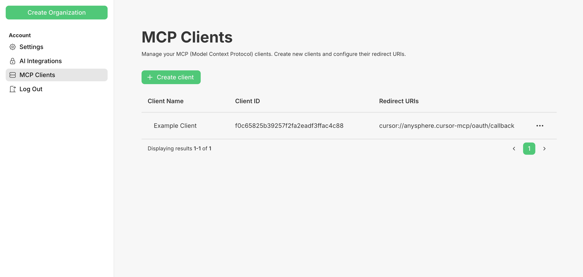
By default, PropelAuth provides hosted pages for authentication, meaning we provide pages like a Login UI, Signup UI, account pages, organization management pages, MCP consent screens, and more.
These UIs can be customized via our dashboard or Terraform are incredibly helpful when you want to go back to building your product.
However, while we do try to make all aspects of these UIs customizable, there are some things are can only really be done when you are writing the code.
That’s why we’ve very happy to share our shadcn/ui component library!
How does it work?
Let’s say you wanted to build a custom login screen. After setting up shadcn/ui, you can add any of our components to your frontend by running:
pnpm dlx shadcn@latest add <https://components.propelauth.com/r/email-password-login.json>
This will create a component called <EmailPasswordLogin /> which you can immediately use:
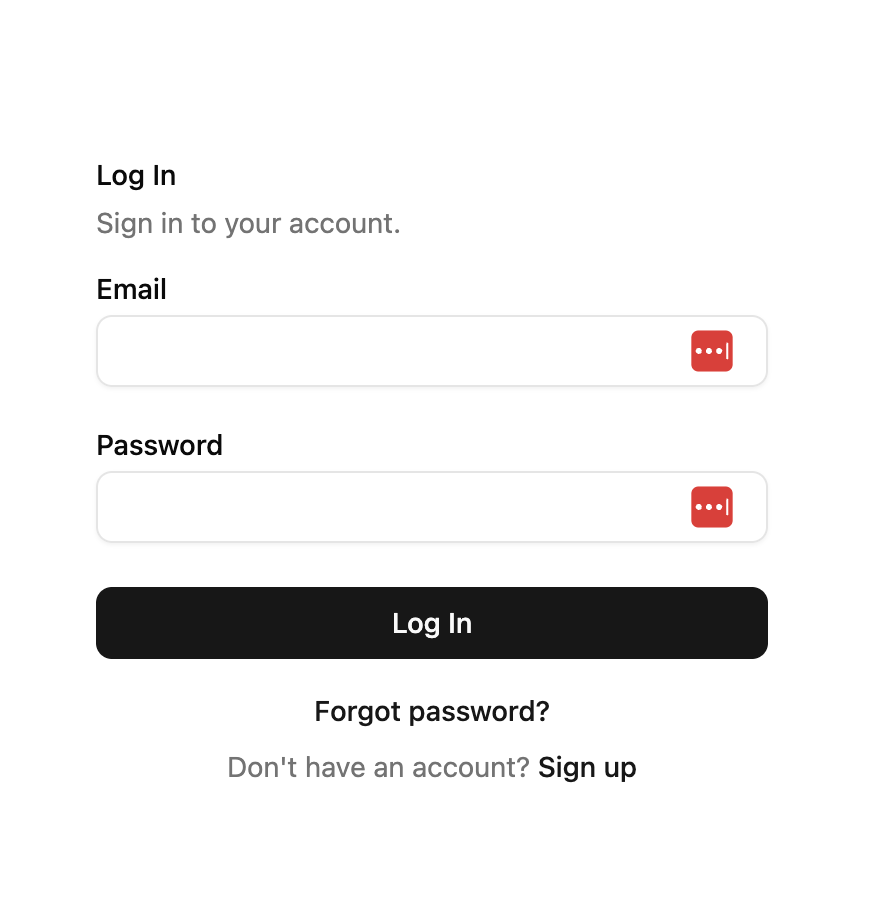
But, since it’s a shadcn/ui component, you also have full access to the code for you to edit/customize.
To show just how customizable it is, here’s a demo that uses Three.js to give you a nice ocean background while you login (and a not-so-nice ocean background when you enter incorrect information):
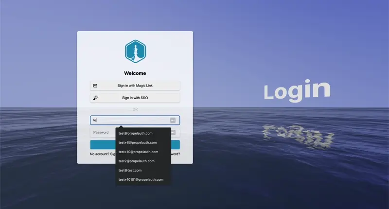
You really can edit any aspect of it.
Learn more
To learn more, check out our documentation. There are components for 2FA enrollment and login, forgot password flows, SSO flows, and a lot more.
Bonus: Try it with our MCP server
Our PropelAuth Integration MCP server can give your AI coding agent of choice context on how to use these custom components.
Even a prompt of just:
Add a custom login page to our product using PropelAuth’s components. Make sure to style it like the rest of our application
is often enough to get a fully customized login page.